


So.
I got myself into trouble by condemning “mood boards” and people who use them.
I thought I would be funny and provocative.
I might have been a jackass, instead.
Look - I understand that many talented people use lots of reference material. Most all visual endeavors demand it. Still, there is one reason I dislike mood boards. The way people build them often reduces the crucial process of research - historic, artistic, cultural, social, architectural - into a mad run through the closet of history. People strip off the most celebrated surface idiosyncrasies from their original intent - and pin them up onto Foamcore boards.
Thus, for example, “revolutionary” stuff always looks like Russian Constructivism or Suprematicsim, with no historical, political or cultural context.
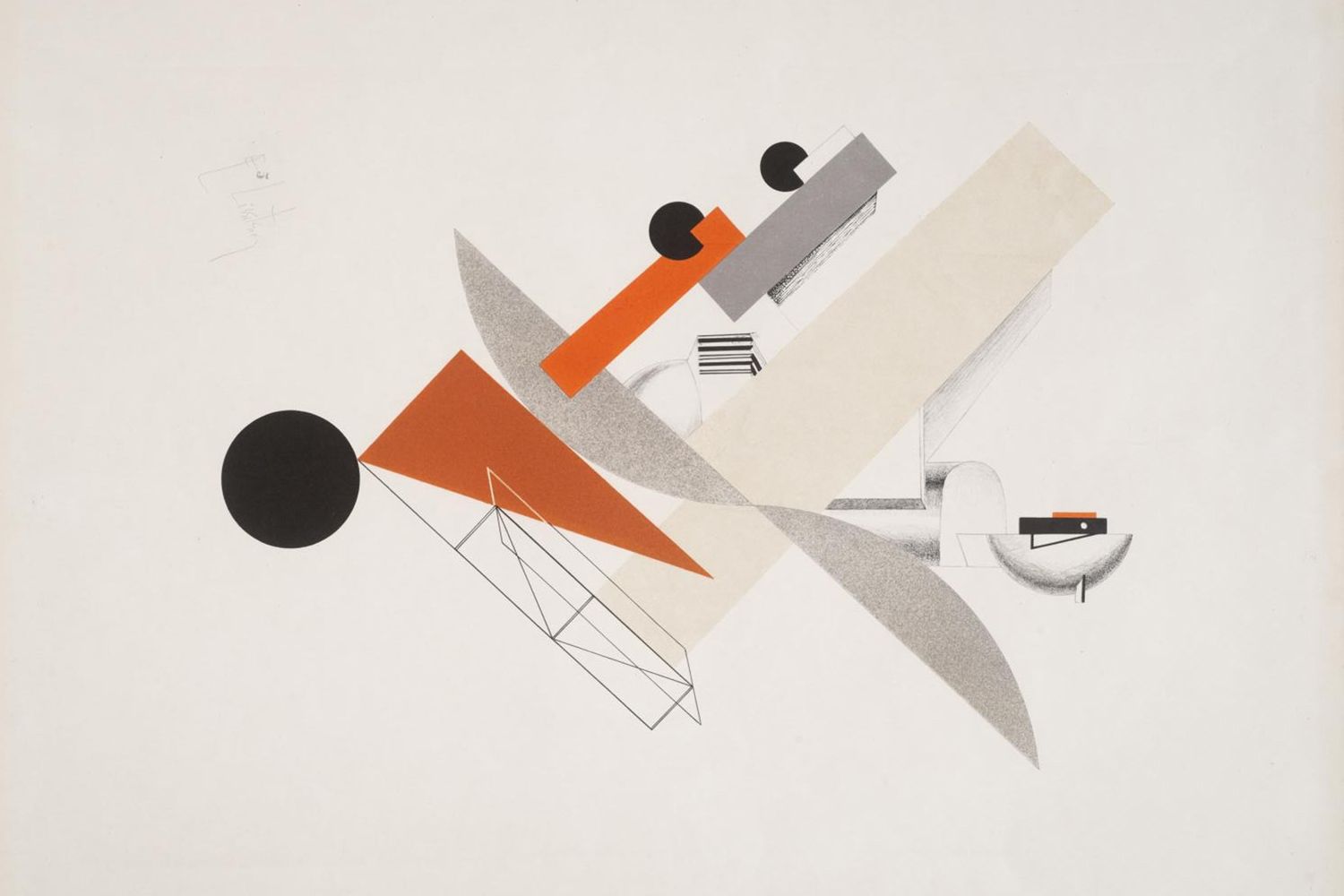
I once met a semi-famous advertising creative director who shamelessly ripped off the work of El Lissitzky for a famous fashion brand’s print ads. Badly. This creative director did a blunt regurgitation of only two pieces of El Lissitzky’s most famous work. But he also combined it with 1980’s ripoffs as well. Esprit catalogs. New Wave Bowie album covers. Memphis.
Add a ham-fisted use of Helvetica Black (Switzerland) and Garamond (French) and it all became a turgid mess.
“Ok. It seems you like El Lissitzky a lot,” I said, trying hard not to sound like an ass.
“Who? This is the Russian Revolution look” he said. “Not…Lizzyski.” “I see that. But your influence here - in all of this work - is Lissitzky himself. Constructivism. Why did you choose his work to emulate? I mean, for this fashion brand?” ‘I don’t know him. But I love all the black and all that red. It feels radical. Cool. So awesome. So retro, too - but still cool, right?”
‘You want to be retro?”
“Nah. But’s it sorta like retro. Like Russian Revolution retro. They loved all this stuff back then.”
“Perhaps. But not for long. Abstraction was eventually condemned as subversive and replaced by Socialist Realism after their revolution.”
“Still, it’s awesome now. It’s still feels, you know…so revolutionary, right?”
“Maybe. But you really don’t know El Lissitzky? I mean, you were trained as a graphic designer, right? Art History classes and everything?”
“I guess…But who cares? I don’t care. It just looks really, really cool to me. Like really revolutionary. I don’t need to know who did it to know it looks this awesome.”
“Cool” and “awesome” were his favorite words. “Not cool” and “not awesome” were his other favorite words.
For the record, El Lissitzky was a Russian artist, designer, photographer, typographer, and an architect. He was a crucial leader of the Russian avant-garde, developing Suprematism with his mentor, Kazimir Malevich. He designed endless exhibitions and posters for the early Soviet Union. His work inspired the Bauhaus and Constructivist movements. In short, his work, his influence, dominated 20th-century graphic design around the world.
Importantly, Lissitzky believed that a designer could be an agent for change. Lissitzky, who was Jewish, began his career illustrating Yiddish children’s books in an effort to promote Jewish culture in Russia. When only 15 he started teaching, an ambition he would maintain across his life. He brought significant innovation and change to typography, exhibition design, photomontage, and book design, producing critically respected works and winning international acclaim. This continued until his deathbed, where in 1941 he produced one of his last works – a Soviet propaganda poster rallying the people to construct more tanks for the fight against Nazi Germany.
I could go on, but to close, his heirs recently established the Lissitsky foundation to preserve the artist’s legacy and prepare a definitive catalogue of his work. The ‘creative director’ knew nothing of this. He also did not care.
But, my guess is that El Lissitzky’s work - ten times removed from its context - made it onto one of his “mood boards.”
Either the one marked “Cool.”
Or the one marked “Awesome.”